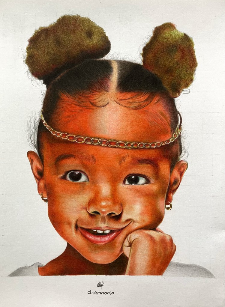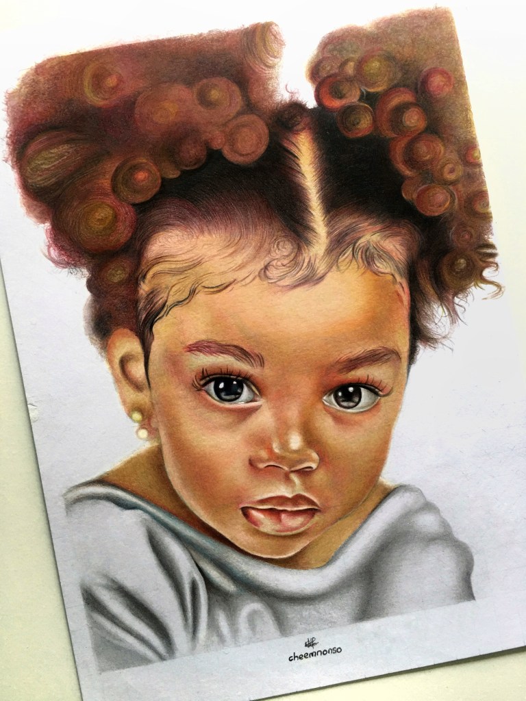
Over the past few weeks, my journey in portraiture and time have shared similar characteristics – they have all been in a blur, lol.
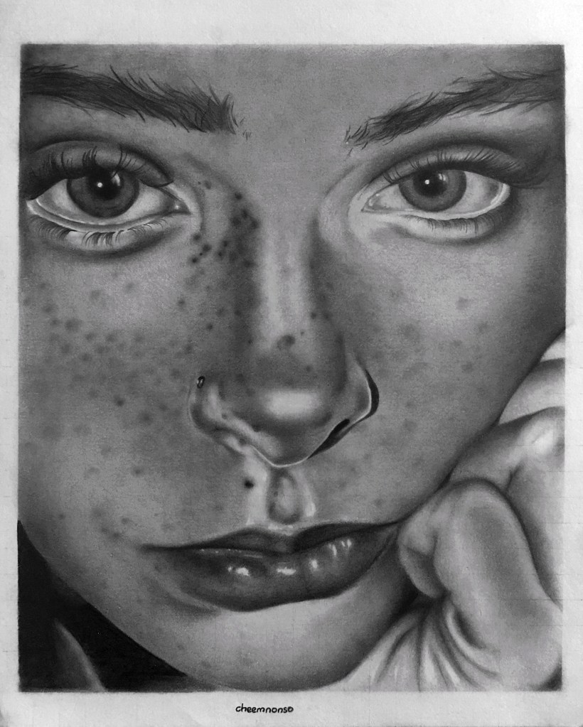
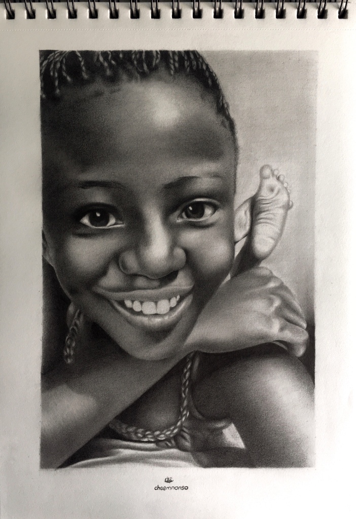
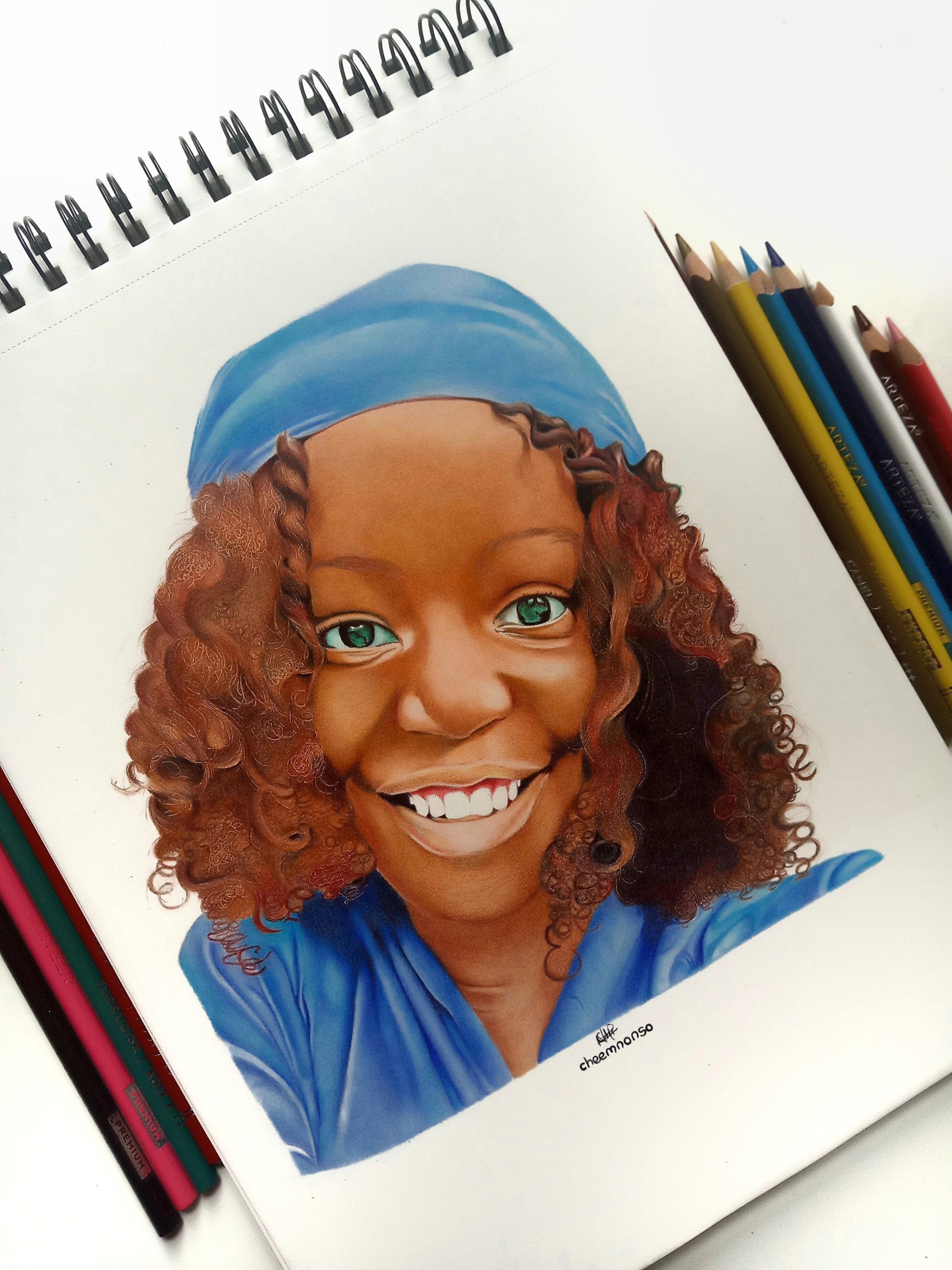
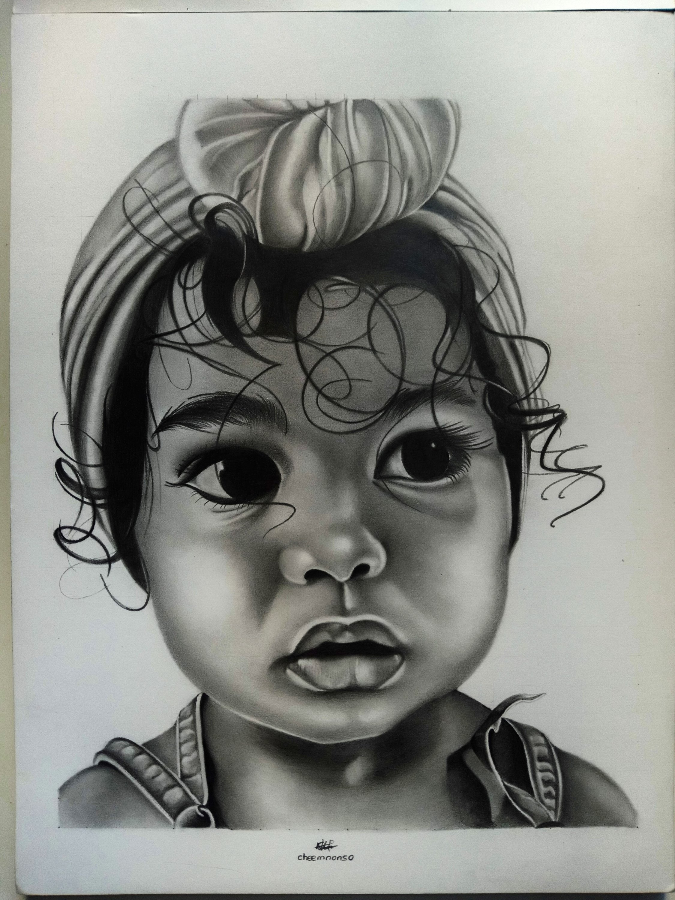
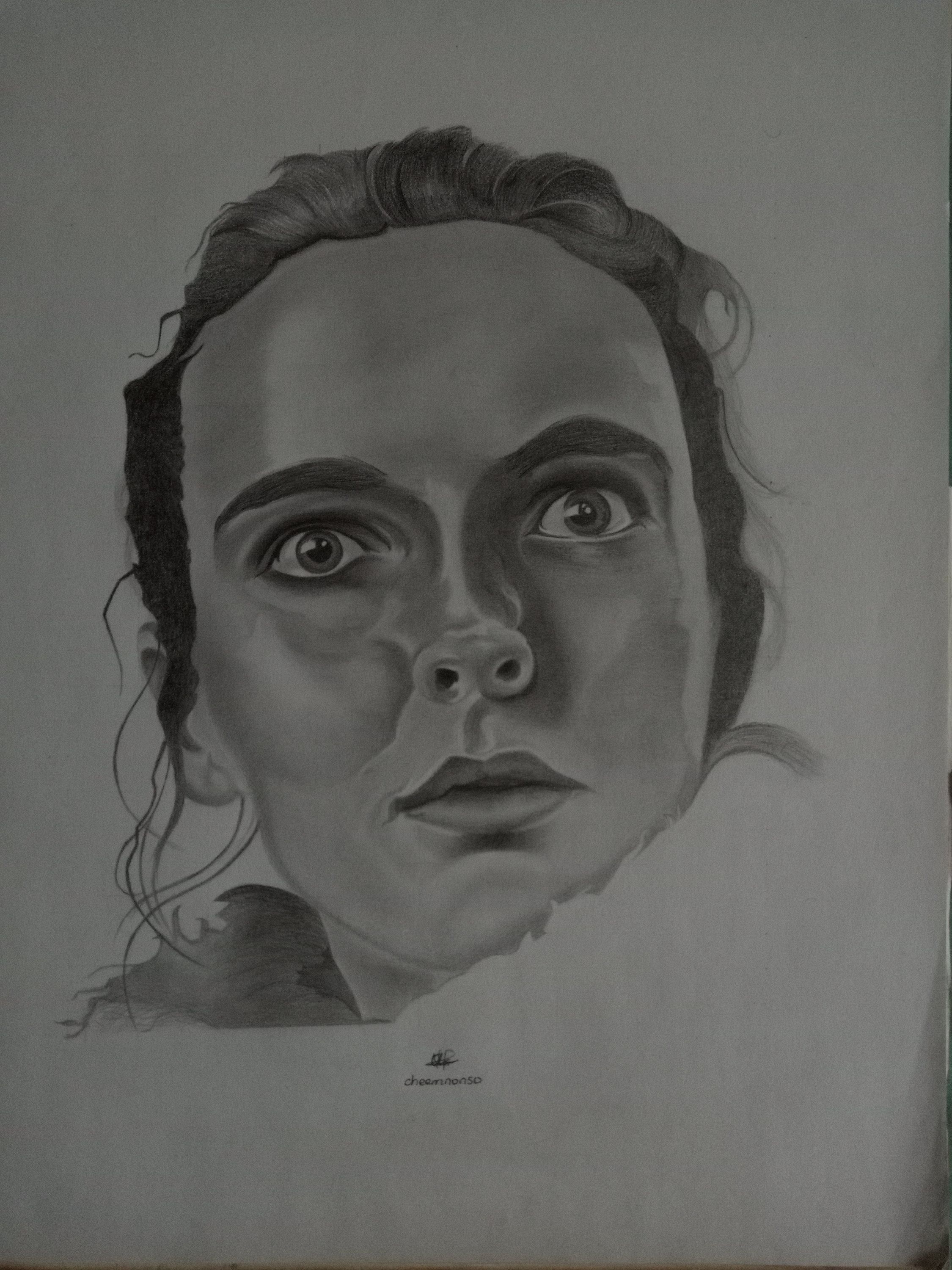
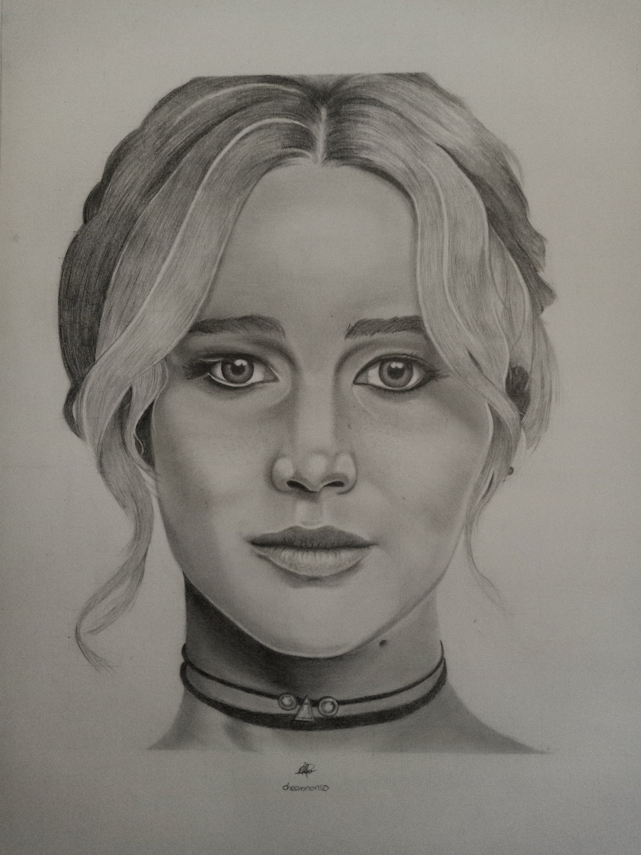
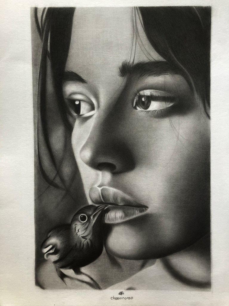
Following my last published portrait, I have been exploring the concepts of focus and blur in graphite portraiture. To create my recent portrait, I built upon recurring themes, namely edge control and gradation.
This is encompassed in the soft edges smudged on the hair that diffuses into the background to create that atmospheric feel. It is also noticeable in the transition from soft to mid tones that reflects the distinction and depth between the bird and the muse’s lips. Still got a way to go in terms of realism, but I couldn’t help but ponder how relatable this is to our existence.
You see, most of the time we think clear images are only seen with the aid of hard outlines, but that is not the case. Hard outlines create only two-dimensional images that exist in planar space (x and y); in reality, the time element (z) is incorporated as well, making life three-dimensional. In physics terms, concisely, seeing life through the hard outlines plunges one into a chasm of space whilst losing track of time.
Now, back to art, some key “what ifs” surfaced whilst making this drawing, and some of them were: What if, in order to see that elusive “big picture”, we apply softness and delicacy to the paths we tread rather than brute-force our way to our respective destinations? What if, to be the centre of one’s attention and focus, we effuse the tenderness of our love and respect to others rather than employ the cowardice of fear and coercion? What if the crossroads between rights and wrongs remain blurred in the veil of diplomacy, rather than etched in the tombstones of war? The answers to most questions are not predominantly in the bluntness of our yeses and nos, but in the grey zones of our maybes – remember, life’s three-dimensional, if not multi, lol.
Anyway, pardon my digression, but I truly enjoyed working on this drawing and being able to convey emotions through a lady and a bird (maybe a cow and a boy next time, wink) is something I’ve always sought. So, what interpretations can you draw from this piece? I’m keen to hear your thoughts.
I hope you have a splendid start to your week, and till next time, Ciao:)
Cheemnonso