Coloured Conceptions II

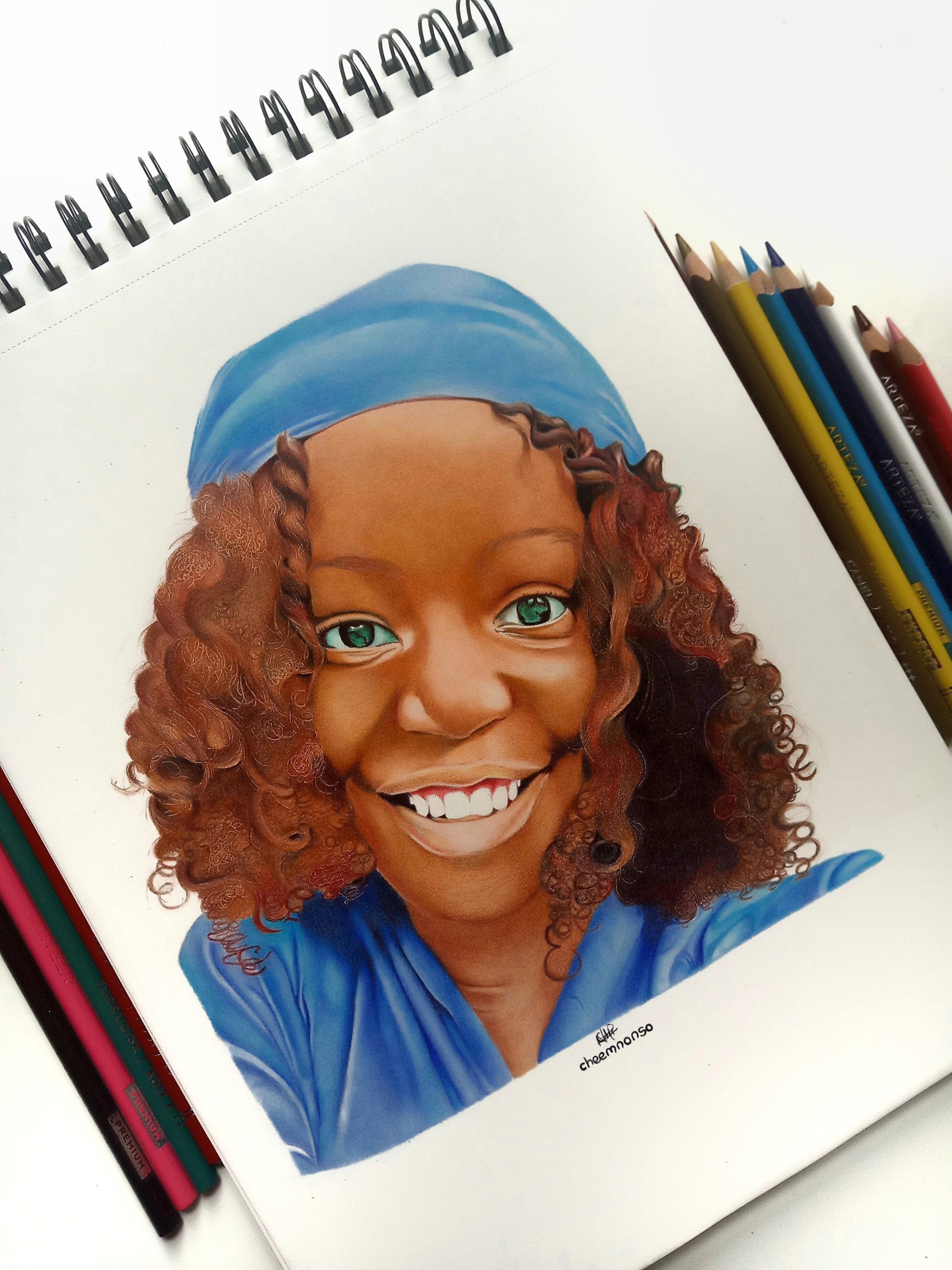
It’s been over four years since I branched out to coloured pencil portraiture in my artistic journey, albeit inconsistently, and I must say it has been quite an experience.

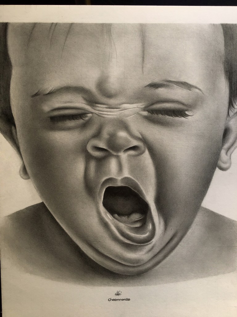
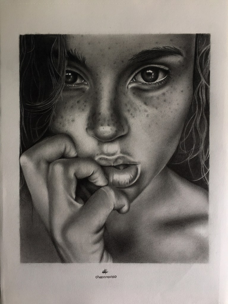
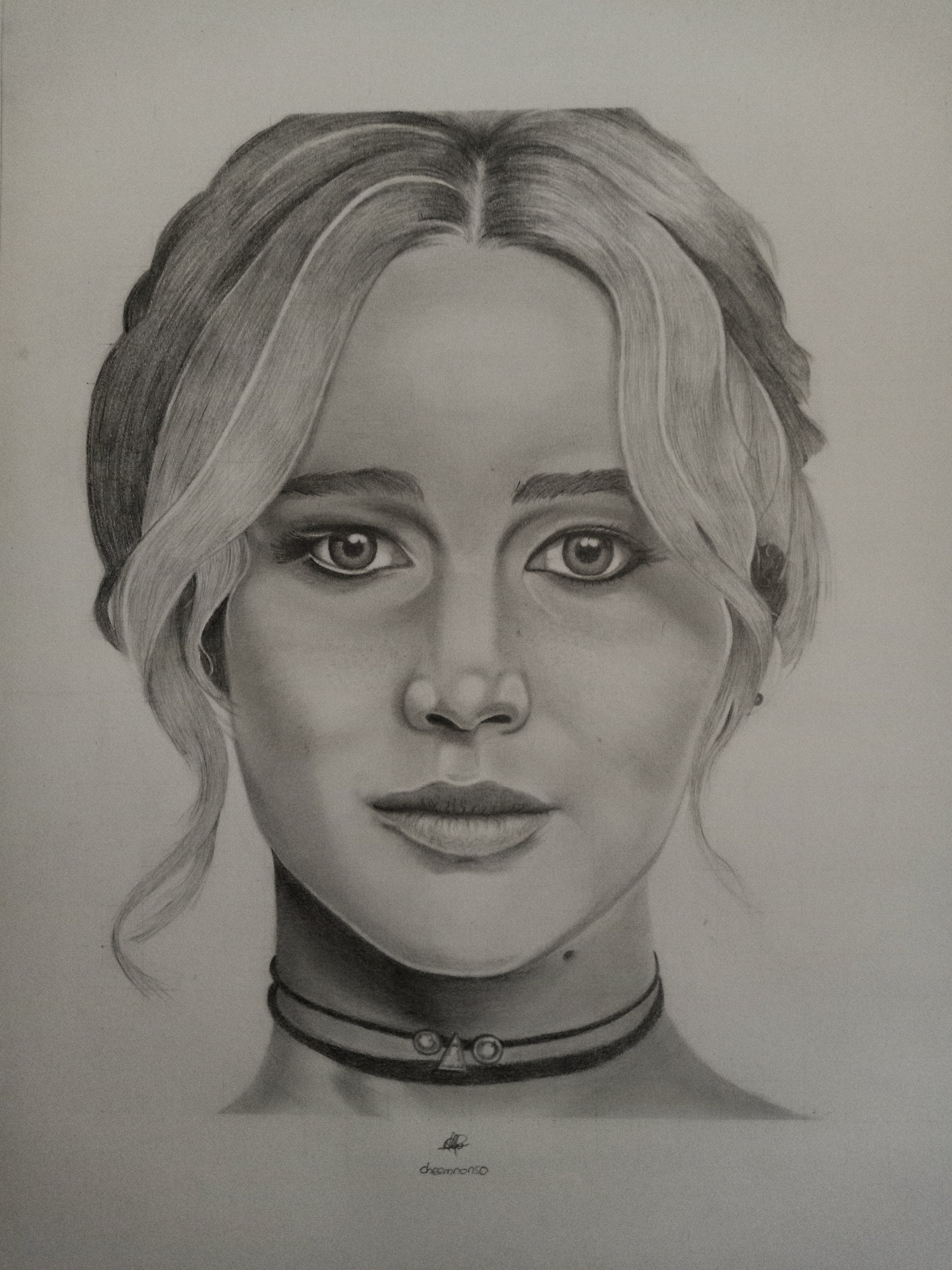
Deterred by the duration of coloured pencil portraiture, most of my drawings (besides animations/cartoons) have been rendered in graphite pencils. However, I must say, that my recent drawing is causing me to reconsider things as I weigh the associated pros and cons.

Portrait of a smiling girl rendered on vellum paper using coloured pencils.

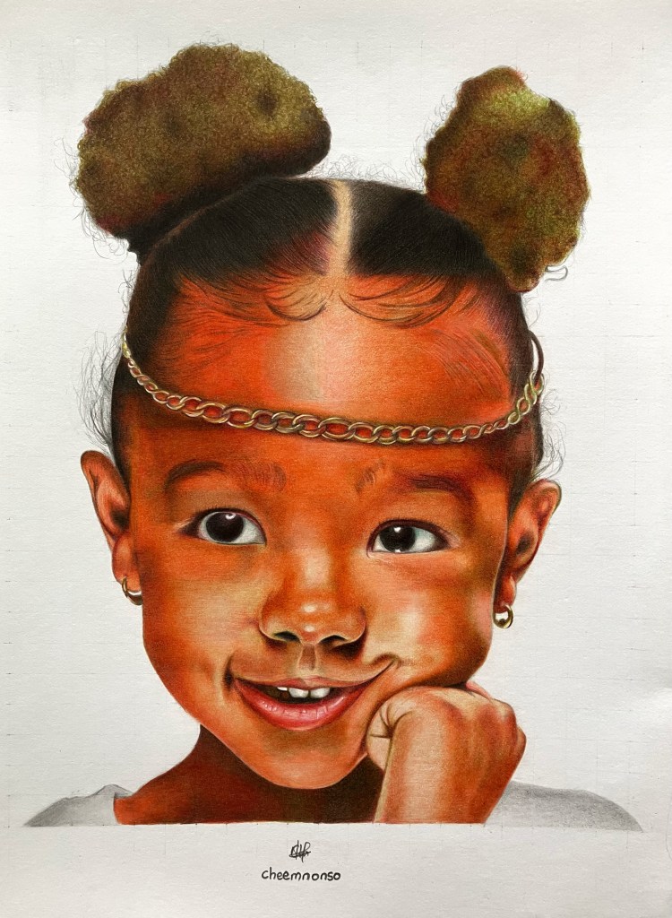
As mentioned in my first coloured portrait post, drawings executed using crayons and coloured pencils do require a sufficient deal of patience as one needs to account for every single hue gradation and the right colour blends to come up with a satisfactory result. On the flipside, results tend to be more visually appealing due to the vibrant colour spectrum available to the artist when compared to the limited range of monochromatic graphite pencils.

In addition to time constraints, coloured pencil portraiture is generally less lightfast (i.e. less resistant to fading over time upon exposure to light) when compared to graphite pencil portraiture. So you may ask, “Why should I invest that much time in these drawings if they tend to fade away faster?” The good thing is that most of my coloured drawings are completed in sketchbooks, which tend to last longer due to limited light exposure. Furthermore, most coloured pencil brands develop improved lightfast pencils to enhance the longevity of our splendid creations, thus mitigating the fading/smudging pitfall in the process.

After considering these aspects, it’s challenging to fully favour one over the other. Thus, my next steps will involve refining techniques to enhance overall portrait realism using both platforms. I’m satisfied with the outcome of this drawing and plan to incorporate more coloured pencils into my portraits to achieve a harmonious balance between the two forms of dry media.

For those who could be discouraged by the time constraints posed by colour pencil drawings or any form of artwork in general, I’ve found that adopting the kaizen approach does work effectively. It generally ensures continuous improvement of a singular artwork by discretizing the artistic stages rather than completing everything in one fell swoop. 

I hope that works for you, and I’m excited to hear any other ideas you have about coloured pencil portraiture or your artistic process in general. In the meantime, I wish you a fantastic week ahead, and until next time, take care!

Cheemnonso

The Perception of Love

A portrait rendition using graphite on Bristol vellum

How do you perceive love? Is she like the seasonal relative that visits only during Valentine’s, Easter, Christmas and other holidays, then vanishes with the wind when the jolly days are over? Does her auburn aura, ever so bright and stunning, blind your judgement of that which is right and wrong? Do you feel like the utterance of Her Majesty’s name to thy ears seeps through the mouth and not from the heart? Sigh!

Well, whilst you try to answer these questions introspectively, here’s L’Antoinette Stines’ reply when quizzed on her perception of love, as sampled in The Carters’ BLACK EFFECT intro.

“Hmm, well, there’s love of children,

Love of self,

Love of God,

Love of a partner,

and all of them have a different shape;

but all of them are the same in the end.

It’s about sensitivity, it’s about passion,

It’s about unconditional giving of self to another person;

And there’s love of humanity,

that’s the love that is right now needed most,

Love of humanity;

but in everything, in all of that love, there is a soul;

It’s like when you take some eggs and break them,

and you take the shells and mix them up,

trying to find the ones that match;

when you find the perfect match

that compatibility results in passion.

results in unconditional giving of self”

Now, that truly packs a lot, I must say; and even though Love has the patience, kindness and endurance to overcome those nagging questions, L’Antoinette makes us remember that it’s more of the unconditional giving of self, whilst prioritizing humankind, thus, suggesting our questions should be confined within the boundaries of the love we give rather than that which we receive.

Alas, this begs another question, at least from my perspective: In a world where certain varying conditions are essential for existence by default, is it possible to give self to another unconditionally?

Anyway, these spurred me to have this drawing; no more than the inscription of love on the muse’s fingers, lol, and I will say I hugely enjoyed it, particularly as this is my first drawing in a while. I also look forward to creating more, as I have just recently got a new pencil and chalk pastel set that I would love to try out in the coming days; but in the meantime, do feel free to share your views on this piece.

Do stay blessed and have a good week ahead. Ciao!

Cheemnonso

The Tired Earthling

The portrayal of a yawning child with graphite pencils on Bristol vellum paper (Portrait Reference)

Back in school, I learned that fascinating mnemonic in biology, MR NIGER D, (Movement, Respiration, Nutrition, Irritability, Growth, Excretion, Reproduction, and Death) that depicts the unique characteristics of living things. Growing up and being handed presents containing both the bliss and vicissitudes of life, I realized more traits exist (e.g., tiredness), and here’s why.

Athletes can feel weary with that over 25-mile marathon, the excruciating 90 minutes of football, or that intense tennis match that’s decided on a tie-breaker. However, tiredness can transcend the realms of the physical into the depths of our mindscape.

A few students are tired of studying during the day while having to work endless night shifts to make ends meet or pay their tuition. There is the mental fatigue that accompanies the tiring psychometrics and assessments a recent graduate must surpass to land that first skilled job. Some people are exhausted from burning the midnight candle to chase that elusive success, while others who are keen to burn the candle are tired of seeking ways to purchase the match that sets it aflame, as the cost of living blows off the roof. Sighs!

Yes, it’s true life sometimes neglects the bed of roses on which our desires lay by handing us jagged knives and bayonets to fight her unending battles, and that in itself makes one fed up with existence. However, the conscientious are tired of how these battles are fought with the handed weaponry, as knives are no longer used to dice the fruits of our labour but to cut corners and stab the backs that feed us.

Where do we go from here? That’s a question I’m tired of pondering over. Thus, I decided to portray my feelings with graphite pencils on Bristol vellum. I am satisfied with my portrayal of this yawning child, particularly after a long while of drawing, which I could blame on a little emotional exasperation, hence my extended break.

I hope moving forward, I’d have the vigor to carry on my artistic journey to keep creating content for you, my supportive reader. Thanks for sticking around, and until next time, Ciao!

Cheemnonso

Ugochi IV

Drawing of Ugochi portrayed with graphite pencils on Bristol Vellum paper.

Watching my sister come of age is one of the most joyous things that have ever happened to me, especially as her birthday marks a year further in my artistic journey. I vividly remember my first drawing of her four years ago, which was largely without form due to the absence of shading in my drawings.

Drawing of my sister four years ago.

Within that four-year frame, my drawings have noticeably improved, and I owe that to YouTube realism tutorials from the likes of Silvie Mahdal, Kristen Patridge and so many more graphite and crayon experts who, through their works, inspired me to keep drawing and subsequently improve. I’d also owe the improvement to the spurring support from you, my WordPress family, and also my sister, whose existence and annual voyages around the sun, have fueled the artistic flame further.

I chose this grimacing picture of her for my recent study, as I continue to explore the world of emotive portraiture, and I must say, I’ve picked quite a few souvenirs from my expedition, including this one, and I hope my future collections only get better from this point.

So, without further ado, I’d like to wish my sister a wonderful birthday, with hopes of umpteen more blissful ones to come.

Cheemnonso

Portraying Moms. (Sketch)

It is Mothering Sunday! A day to acknowledge and honor the adorable ladies who bore and aided our passage to Earth. However, mothers should not be limited to women who bear children and aid in procreation, as many who proved infertile have nurtured, fostered, and raised children who have been seemingly abandoned by their so-called procreators. These, I liken to the sweet roses of love everblooming in a desolated land of hate, thus, earning their right to be called mothers.

Mother and child portrayed with STÆDTLER graphite Pencil set on Bristol vellum surface paper.

In my little way of honoring mothers, I peeked through Pinterest to find reference photos depicting motherhood and ended up with my recent portrait study. I found it captivating and challenging as it is my first portrait with two faces, albeit completed with graphite pencils on a 9 by 12 inch Bristol vellum paper (small surface given reference photo). In my After Dark post, I highlighted the importance of shading drawings of big sizes, as this captures more details in your drawings, thus, providing more accuracy in drawings. However, my recent study was mainly for illustration purposes and I was okay with how it turned out in the end.

Without further ado, I wish a happy Mothering Sunday to all the moms, with hopes you continue to be that undying source of love to your offspring, family, and the world in general. Do stay blessed.

Cheemnonso

Inter-Dimensions. (Sketch)

Completed with A4 cardboard paper and STÆDTLER graphite pencils. (Portrait reference)

What do you see when you close your eyes? Yep! You read that right. What do you see when you close your eyes? For lovers, the astral plane becomes the thin veil between reality and that fervent french kiss. For poets, words become ventriloquists, breathing life into the inanimate, whilst the living become statues of its awe. For cheerful givers, they see blooms of happiness sprouting from seeds sown in the needy’s bosom, and for non-givers, well, they see nothing, for they had already turned the blind eye, lol. Anyways, the answer to this question still saunters back and forth on the bridge between reality and our fantasies.

Fascinated by this question and the portrait reference (by Sandra Parreno photography , whose character seems torn between the 2D and 3D verse), I decided to make this my first drawing of the year 2022.

Looking back at my drawings in 2021, I noticed significant improvements from 2020, particularly in maintaining shading segue, to add more depth to realism; however one crucial drawback still exists: portrait likeness.

Last drawing of 2021 completed with STÆDTLER graphite pencils and Arteza Drawing pad (80 pages). Drawing deviated from portrait likeness, however shading seemed okay. (Portrait reference)

Achieving portrait likeness will be the key area I’d work on this year as I try to build on more emotive drawings from years past, and judging from my recent portrait, I see good signs in shading, particularly as the paper used was a bit low grade (still on my media exploration quest); However, the rooms for improvement in portrait likeness ultimately need inhabiting.

Please, feel free to reach out if you’re interested in learning some of my portrayed techniques, and I’d also appreciate every critical input on my works. Thank you.

Cheemnonso

Drawing Yelena. (Sketch)

Sketchbook: Arteza Drawing pad (80lb)

Media: Black Widow/ Arteza Color Pencil set

The reference this time was particularly inspired by my choice of coloured pencils, which was predominantly dark-toned black widow pencil set, hence my drawing of the character, Yelena Belova (portrayed by Florence Pugh), from the Black Widow movie.

I have had this pencil set a while now, but it was majorly used to underpin my prevalent Arteza coloured pencils in colour drawing, so I decided to make an exception this time with role reversals.

Three particular pencil shades were used for skin tones including Leather, Suede and Olive brown, whilst both Midnight and Greyhorn variants were used for her gear. Arteza’s Pink macaroon, however, was used for blending the skin out, albeit not hundred percent achieved. This was subject to my carefulness with the sketchbook paper, as the burnishing technique can be somewhat hostile and aggressive on drawing papers.

Nonetheless, these pencil sets have proved to be a great combo in colour pencil realism for me, and I’d keep using them, for now, to see how I improve off them.

I hope you enjoy this piece as much as I enjoyed creating it, and, do have a blessed week ahead. Ciao!

Cheemnonso

Ugochi III. (Sketch)

Graphite rendition of Ugochi

Sketchbook: Arteza Drawing Pad (80lb)

Medium: STÆDTLER Graphite pencil set

It’s that time of the year again, when my baby sister celebrates her birthday, consequently signaling one more progressive year in my artistic journey. At this point, she knows she has become my most used muse, but one thing she does not know is what reference picture I will choose of her, or which medium I’d portray her in (colored pencil or graphite). This has always made her birthday expectations somewhat of a surprise.

This time, however, I chose a tricky reference picture; one that she discarded at the time due to poor photo lighting. I chose this because it presented various challenging features including:
• portrayal of light and shadows
• achieving depth in drawing braids,
• realistic body features (hands and foot)
• cloth form and likeness.

I am happy with the performance in some of these areas and how it turned out generally, particularly as she was carved from another page on my sketchbook. More importantly, I am glad she loved it bearing in mind she once disliked the original photo; So, I’d like to use this opportunity to wish her a very happy birthday with many more years, hoping I’d capture her alluring moods in the years to come.

By the way, if you have any questions concerning improvements in portrait realism or realism in general, I’d be more than willing to help. Conversely, I’d appreciate critical inputs on some flaws that could help me improve as well. For now, however, do have splendid days ahead. Ciao!

Cheemnonso

Alma de Cristina. (Sketch)

Graphite rendition of Cristina Otero’s Soul Portrait.

Sketchbook: Arteza drawing pad (80lbs)

Media: STÆDTLER Graphite Pencils

Still on expressive portrait drawings, I stumbled on this monochromatic reference photo on Pinterest (as ever), and after finding it captivating, I decided to give it a try with my graphite pencils.


After some digging, I discovered that the photo is indeed a self-portrait of Cristina Otero, a young Spanish photographer, who captured this using the front camera of a Huawei P10 smartphone, of which she dubbed a Soul Portrait, hence the title of this blogpost in Spanish.


This time, however, I opted for my normal 80-paged Arteza drawing book to recreate this photo, rather than the much smoother Bristol vellum surface paper, as I seek to complete the sketchbook soon enough, amidst hectic school and work schedules.


The drawing came out coarser, as expected, because the drawing pad has got more tooth than vellum surfaces. It is evident from the original photo that I still struggle a bit with portrait likeness, probably due to the inaccuracy of my grids, which needs to be improved, thus, giving me room for progression in portrait realism.


In all, the drawing seemed satisfactory for me, if for anything, the depth of realism on the hand figure, and judging from this, there will be more graphite and colored pencils drawings emanating from this drawing pad, hopefully with better results. Fingers crossed!

Cheemnonso

Drawing Zendaya. (Sketch)

Sketchbook: Bienfang Bristol Vellum paper

Media: Black Widow/Arteza pencils

Two months gone now, and the gliding thoughts of how to go about realism and portraiture in 2021 still seeks the right perch. Most of it has been down to busy school/work schedules, but I realized that no schedule can ever be too busy to have a decent artwork, hence my recent drawing.

My portrait reference study is no other than the Emmy award winner (the youngest if I might add) for her role as a troubled teen in the somewhat brilliant HBO series, Euphoria. She also stars as a trapezist in The Greatest Showman, and as MJ (Michelle Jones) in SpiderMan: Homecoming, Far from home and No Way Home, where the latter is still in the works. Ladies and gents, Zendaya Maree Coleman needs no further introduction.

What particularly influenced my choice of reference is not just because of her delectable roles in movies (Malcolm and Marie for starters), but also the profoundness of her skin colour. As soon as I beheld her picture on Pinterest, I realized it has been a while I drew in coloured pencils, so I decided to take up this portrait study. Who says inspiration does not trump busy schedules?

First, I decided to try out the blending of the coloured pencils on the coarser side of the Bristol vellum paper, as I did with graphite pencils for my Freckled Smile work, and I must say, coloured pencils feel a lot smoother on this coarse side of the paper when compared to graphite pencils. Building layers of colours also seemed effortless, but it was accompanied by a cuddly drawback; more drawing time. However, having used the coarse side of vellum papers for both graphite and coloured pencils, the coarse side feels more suited for coloured pencil artworks, while the smooth side seems best for graphite pencils, at least in my case, with favourable results.

For the rest of the artistic journey this year, I’d build on these media exploration outcomes whilst working on achieving portrait likeness for different facial expressions (with interludes of other studies) using dry media. Garnering inspiration from sources like Pinterest, it’d be amazing hopefully. Fingers crossed.

Cheemnonso

Freckled Smile. (Sketch)

Sketchbook: Bienfang Bristol Vellum paper

Media: STÆDTLER Graphite pencils

As a developing artist in portraiture, I have always wondered what an ideal and challenging reference portrait would entail. Could it be an elderly face where the mien is calm as the sea, and its wrinkles are like estuaries of flowing grace, or could it be the face of an adorable child with dimples that could entomb and smother likes of the Great Depression? The truth is, nothing is ever ideal, but my recent reference portrait is just as close as one can get. The partial eye squints, subtle wrinkles, freckles, dimples, smile connecting bulging cheeks, and pigtails, capture what I believe would be an artist’s dream in terms of realism studies, and trust me, it didn’t disappoint in difficulty given the challenging circumstances.

For this drawing, I had to make use of graphite pencils and Bristol vellum paper, as I did for my Bristol Baby sketch, but this was with a telling twist. I came across several YouTube tutorials that suggested that the back of a Bristol vellum paper is the most ideal for drawings as it is coarser and has more tooth which any preferred medium would love to cling onto, so, I decided to give this a try. However, this proved frustrating early on as it required lots of graphite layers to fill the coarse regions of the paper, and therefore translated to more hours of drawing compared to my Bristol Baby sketch. Hopes and smiles I had of drawing this portrait had become spotted, hence the figurative name of this blog post. It ultimately turned out to be the test of my patience levels in art, and you should have witnessed the sigh of relief I gave off when I completed the drawing; Phew! I was pleased with the final portrait at long last, and to be honest, I could not care less about how tedious the means to the drawing was, as long as it is justified in the end.

Notwithstanding though, feel free to use this surface for your artworks, and do let me know of your experiences.

Cheemnonso

Coloured Conceptions

Sketchbook: Arteza Drawing pad (80lb)

Media: Black Widow colour pencils.

In coloured portrait realism, one common misconception amongst budding artists is that the more expensive the pencils used, the better the artworks. Well, that may be true in some cases, especially in the grip of professionals; however, for beginners, several factors come to play like patience, tone/depth understanding and also the art of gradations. The truth is, every artist has that wand of a pencil that seem to bend to his/her will and create magical art pieces. I mean, I’ve seen excellent artworks completed with Crayola pencils that could rival those completed with Caran D’ache luminance pencils; hence, it’s not just a matter of the pencils, but, the dexterity of the artist.
However, I’ve been exploring mediums lately to find suitable colour pencil sets for portraits. On my quest, I eventually crossed paths with this Black Widow colour pencils, which I used to portray the innocence of this child. Initially, I had a creepy feeling towards the pencil set, considering its name, but I gradually grew fond of it (nothing to worry about for arachnophobes). I particularly liked the dark skin tone variant, as it provided lots of vibrant colours to layer and blend. The pencils generally proved promising and have been included in my list of dependable pencils for portrait drawing.
Are there any other pencils you know of that is not part of the mainstream media and has presented excellent results for you? Do let me know and who knows, it could be my one and only.

Cheemnonso

Ugochi 2.0. (Sketch)

Sketchbook: Arteza Drawing pad (80lb)

Media: Arteza Coloured pencils.

It’s been exactly three years now I rekindled my old flame for drawing, and since then, I made it a tradition to have a drawing of my baby sister for her birthday. In that time, I’ve had four drawings of her, which I like to see as a present to her and also as some sort of annual progress in my artistic journey.

This particular drawing is portrayed as the remake of a graphite sketch I had of her in 2019. I particularly enjoyed this drawing as working in coloured pencils seemed to prove a challenge at the early stages (especially with the skin tones), but ultimately, turned out okay. After sketching my first colour pencil portrait not too long ago, I had serious doubts I’d be able to replicate the levels attained in the drawing, but having this recent portrait of my sister has really served as a confidence booster to take on other challenging art studies with coloured pencils.

So for this and many more glorious reasons, Happy birthday Ugochi. Stay gold!

Previous sketches: 2019b, 2018

.

Cheemnonso™

Hued Inceptions. (Sketch)

Sunday Sketchbook: ARTEZA Drawing pad

Media: ARTEZA Coloured pencils

Inspired by my last post, I decided to make my first portrait sketch in coloured pencils after dabbling in graphite pencils for a while now; and I must say, it felt good; even though it took quite some time to complete than those previously sketched with graphite pencils.

Given the unlimited shades of hue, sketching in coloured pencils could prove daunting when one tries to blend several colours, just to match the right skin tones, capture the golden mesh of a lass’s tress or portray the azure eyes of an adorable child; and if the artist isn’t ready for PATIENCE 101, he or she could easily be dispirited. But, I’m glad that wasn’t the case here, and also happy to see the drawing to its reasonable completion.

With this, I’m ready to introduce the newest member of the dry media family (Coloured Pencils), hoping she, alongside graphite pencils will be my knights in shining armor when new shading challenges come forth, particularly in these troubling days that needs a lot to keep sane.

.

Cheemnonso™

Jenny. (Sketch)

Page 4 of my sketchbook

After my camaraderie with HB pencils, I decided to get a graphite pencil set ranging from hard to soft grades (2H – 8B) in order for me to plumb the depths of sketching and shading. To be honest, having a wide range of pencil grades to choose from, seem to ease the attainment of value and depth in portrait drawings.

So without further ado, here’s my recent stop, Jenny, on my progressive artistic journey.

.

Cheemnonso