Coloured Conceptions II

It’s been over four years since I branched out to coloured pencil portraiture in my artistic journey, albeit inconsistently, and I must say it has been quite an experience.

Deterred by the duration of coloured pencil portraiture, most of my drawings (besides animations/cartoons) have been rendered in graphite pencils. However, I must say, that my recent drawing is causing me to reconsider things as I weigh the associated pros and cons.
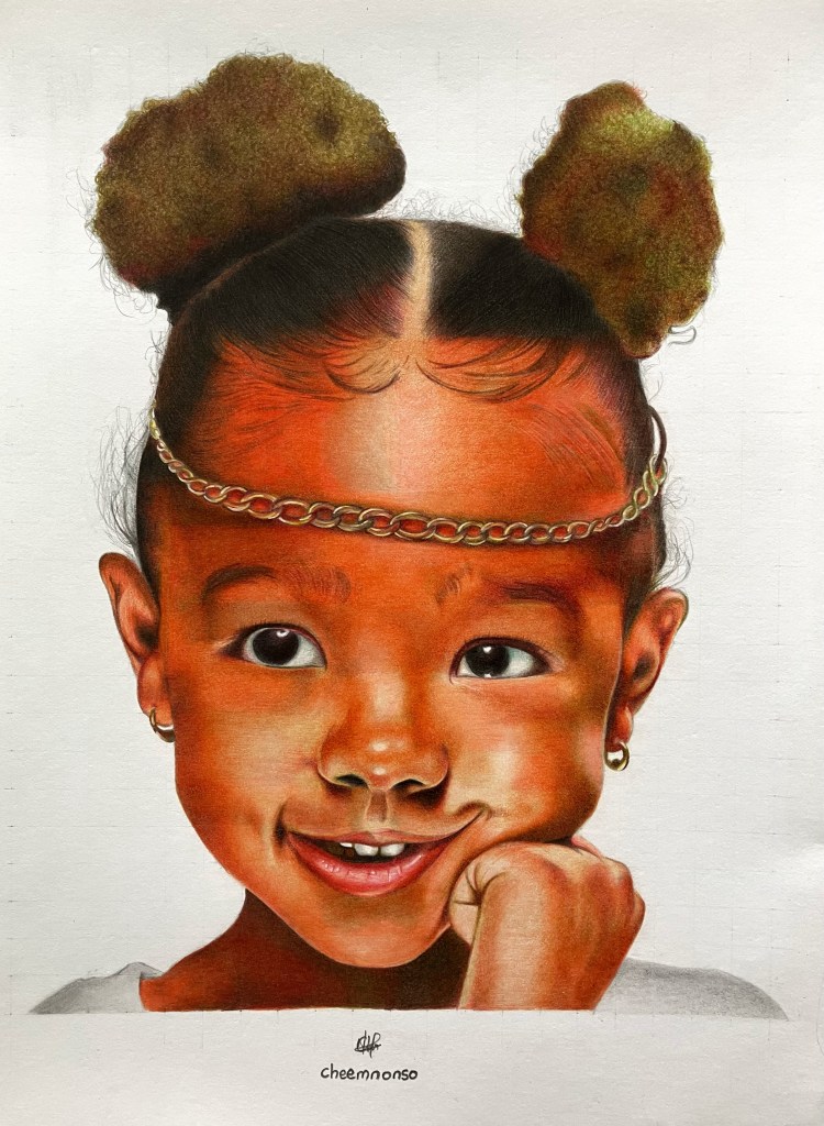
Portrait of a smiling girl rendered on vellum paper using coloured pencils.

As mentioned in my first coloured portrait post, drawings executed using crayons and coloured pencils do require a sufficient deal of patience as one needs to account for every single hue gradation and the right colour blends to come up with a satisfactory result. On the flipside, results tend to be more visually appealing due to the vibrant colour spectrum available to the artist when compared to the limited range of monochromatic graphite pencils.

In addition to time constraints, coloured pencil portraiture is generally less lightfast (i.e. less resistant to fading over time upon exposure to light) when compared to graphite pencil portraiture. So you may ask, “Why should I invest that much time in these drawings if they tend to fade away faster?” The good thing is that most of my coloured drawings are completed in sketchbooks, which tend to last longer due to limited light exposure. Furthermore, most coloured pencil brands develop improved lightfast pencils to enhance the longevity of our splendid creations, thus mitigating the fading/smudging pitfall in the process.

After considering these aspects, it’s challenging to fully favour one over the other. Thus, my next steps will involve refining techniques to enhance overall portrait realism using both platforms. I’m satisfied with the outcome of this drawing and plan to incorporate more coloured pencils into my portraits to achieve a harmonious balance between the two forms of dry media.

For those who could be discouraged by the time constraints posed by colour pencil drawings or any form of artwork in general, I’ve found that adopting the kaizen approach does work effectively. It generally ensures continuous improvement of a singular artwork by discretizing the artistic stages rather than completing everything in one fell swoop. 

I hope that works for you, and I’m excited to hear any other ideas you have about coloured pencil portraiture or your artistic process in general. In the meantime, I wish you a fantastic week ahead, and until next time, take care!

Cheemnonso

Happy Holidays II. 🎄

My Drawing of a Super Christmassy Mario

From the starry skies of the Mushroom Kingdom to the quirky inns of Nonso’s world, Mario and I would like to wish you a merry Christmas and happy holidays.

May all the good tidings reaped from this festive period spill forth into your new year. Do enjoy and stay blessed.

Cheemnonso.

Drawing Yelena. (Sketch)

Sketchbook: Arteza Drawing pad (80lb)

Media: Black Widow/ Arteza Color Pencil set

The reference this time was particularly inspired by my choice of coloured pencils, which was predominantly dark-toned black widow pencil set, hence my drawing of the character, Yelena Belova (portrayed by Florence Pugh), from the Black Widow movie.

I have had this pencil set a while now, but it was majorly used to underpin my prevalent Arteza coloured pencils in colour drawing, so I decided to make an exception this time with role reversals.

Three particular pencil shades were used for skin tones including Leather, Suede and Olive brown, whilst both Midnight and Greyhorn variants were used for her gear. Arteza’s Pink macaroon, however, was used for blending the skin out, albeit not hundred percent achieved. This was subject to my carefulness with the sketchbook paper, as the burnishing technique can be somewhat hostile and aggressive on drawing papers.

Nonetheless, these pencil sets have proved to be a great combo in colour pencil realism for me, and I’d keep using them, for now, to see how I improve off them.

I hope you enjoy this piece as much as I enjoyed creating it, and, do have a blessed week ahead. Ciao!

Cheemnonso

Drawing Zendaya. (Sketch)

Sketchbook: Bienfang Bristol Vellum paper

Media: Black Widow/Arteza pencils

Two months gone now, and the gliding thoughts of how to go about realism and portraiture in 2021 still seeks the right perch. Most of it has been down to busy school/work schedules, but I realized that no schedule can ever be too busy to have a decent artwork, hence my recent drawing.

My portrait reference study is no other than the Emmy award winner (the youngest if I might add) for her role as a troubled teen in the somewhat brilliant HBO series, Euphoria. She also stars as a trapezist in The Greatest Showman, and as MJ (Michelle Jones) in SpiderMan: Homecoming, Far from home and No Way Home, where the latter is still in the works. Ladies and gents, Zendaya Maree Coleman needs no further introduction.

What particularly influenced my choice of reference is not just because of her delectable roles in movies (Malcolm and Marie for starters), but also the profoundness of her skin colour. As soon as I beheld her picture on Pinterest, I realized it has been a while I drew in coloured pencils, so I decided to take up this portrait study. Who says inspiration does not trump busy schedules?

First, I decided to try out the blending of the coloured pencils on the coarser side of the Bristol vellum paper, as I did with graphite pencils for my Freckled Smile work, and I must say, coloured pencils feel a lot smoother on this coarse side of the paper when compared to graphite pencils. Building layers of colours also seemed effortless, but it was accompanied by a cuddly drawback; more drawing time. However, having used the coarse side of vellum papers for both graphite and coloured pencils, the coarse side feels more suited for coloured pencil artworks, while the smooth side seems best for graphite pencils, at least in my case, with favourable results.

For the rest of the artistic journey this year, I’d build on these media exploration outcomes whilst working on achieving portrait likeness for different facial expressions (with interludes of other studies) using dry media. Garnering inspiration from sources like Pinterest, it’d be amazing hopefully. Fingers crossed.

Cheemnonso

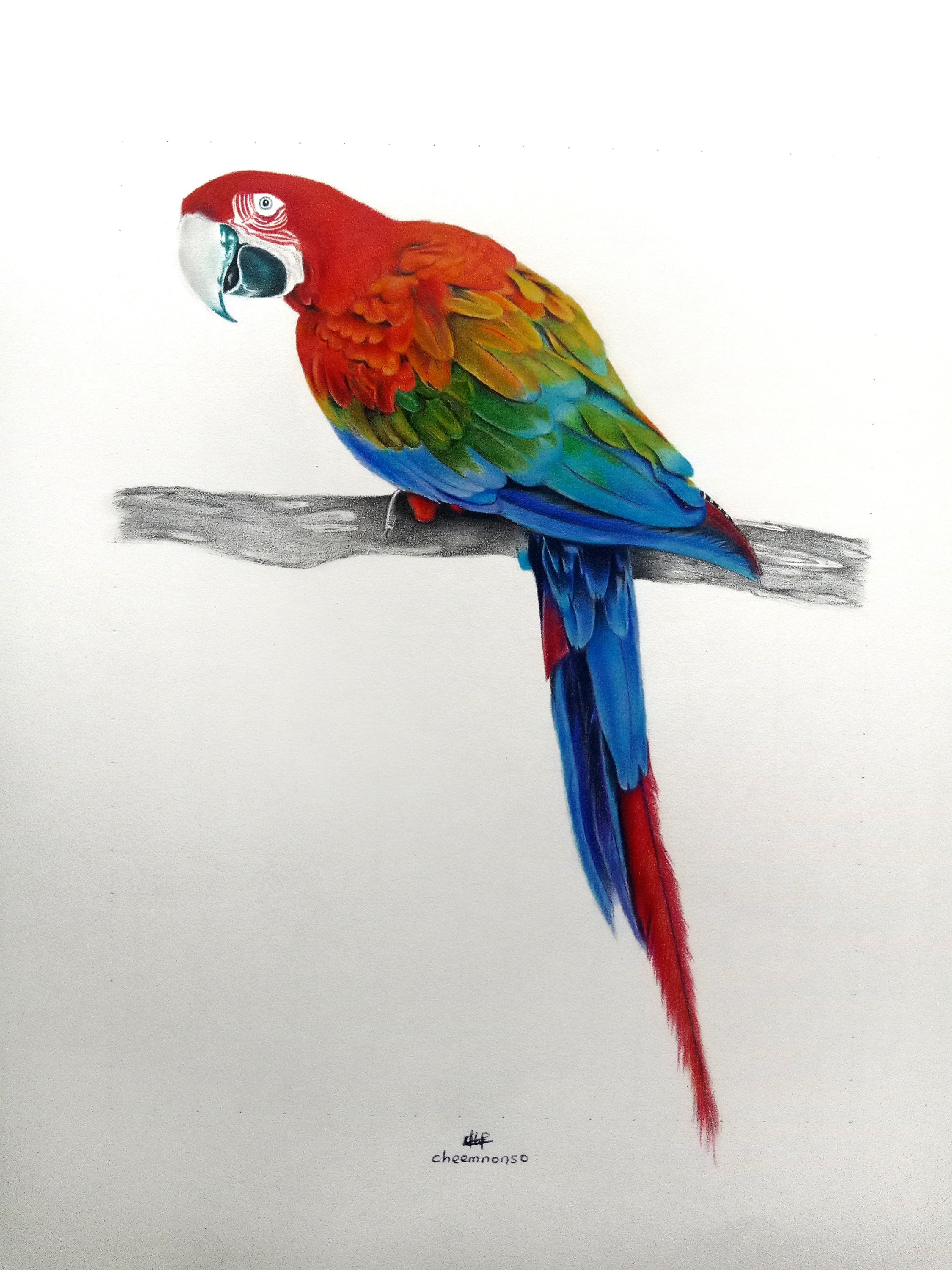
The Macaw’s Perch. (Sketch)

Sketchbook: Arteza Drawing pad (80lb)

Media: Arteza Coloured pencils, 3B Graphite

Inspired by a lot of talented artists lately, I finally decided to have my first animal study (a very brief break from portraiture), and it’s no other than my favorite poetic bird; Macaws, particularly, the Scarlet Macaw. If you’re conversant with my works, you’d discover I’ve used her reference in some poems of mine including The Spree, The Parade and most recently in The Beauts, and these I really enjoyed writing.

What I particularly love about this bird is how her plumage exudes different colours, so much that one could sense rainbows getting jealous. Sadly though, blending these colors could actually prove difficult as colour segue could take time to be properly administered on the sketch.

However, I’m okay with how this drawing turned out and I look forward to hearing your favourite bird and how it rivals a Macaw’s beauty (Still undisputed though).

Cheemnonso